Table of Contents
What is Astra
Astra is one of the free WordPress themes without flaw, built for speed and focus on performance.
Why choose Astra?
Benefit to use Astra theme
- cut down development time
- lighter (improve speed and performance of website)
- compatible with popular page builder (eg:Elementor)
- SEO friendly (content that is built based on search engine format)
- easy for non-programmer to build a website
- easy to install, upload either through dashboard or ftp
- easy to find documentation, tutorials
- compatible with plugin
- compatible with WooCommerce
- Can show real time live preview
Before begin:
Access to one WordPress website
Login WordPress dashboard
- Add /wp-admin at the end of your website url
(eg: https://www.yourdomain.com/wp-admin) - Enter your username and password

Once login you will be redirect to WordPress dashboard
1.0 Install Astra theme
- Login to WordPress dashboard
- Go to Appearance > Theme > Add New

- Search for Astra, Install and Activate it

2.0 Install Starter template
Starter templates provide you with a complete site template. All you need to do is add your content and image.
- Go to Plugin > Add New from dashboard
- Search for Starter Templates
- Install and Activate it

- After that, Go to Appearance > Starter Templates
- Browse through the library and select the template without AGENCY label at the top right corner.
This is because Agency template only available for Astra Premium Sites
- You can also click the dropdown to filter the templates

- Click on the template you want and the page below will shown.
Preview at the left side will preview the whole site in new tab - Click Import Complete Site at the right

- A pop out shown as below, Check all the box and Click Import

- Once installation is completed, pop out shown as below
Click View Site if you want to view your imported site
3.0 Prepare Material for your website
- Landing page banner
1920x1100px - Homepage banner
1920x1080px - Logo(white and color)
Small: 180x60px
Big: 360x120px
Vertical 500x500px - About us and contact us banner
1920x1100px
Sub image:1200x675px - Account banner
1920x1080px - Carrying logo
150x150px
4.0 Astra Pro Features & Functions
Astra Pro Addon is a premium plugin that provides more customization options and features to Astra themes.
Astra Pro features
- Navigation menu
- Blog Layouts
- Site Layouts
- WooCommerce
- Sticky header
- Page header
- More color controls
- Better typography
- Custom layouts
- Scroll to top links
- Footer widget
- Header sections
- More header designs
- Spacing control
You need to purchase Astra Pro Addon and activate the license before start using it. There are several packages offered by Astra. The Astra Pro package used here is Agency Bundle Package. Every customization option explained includes features in the Astra Pro package.
Install Astra Pro
- Download plugin from store that you purchase Astra Pro
- Compress the plugin to store as zip file
- Go to Plugins > Add New

- Click Upload Plugin

- Choose your plugin file in zip format

- Click Install Now
Start using Astra Pro
- Go to Appearance > Astra Options

- Activate features below Available Astra Pro Modules as your need

5.0 Header
- Go to Appearance > Customize from dashboard

- Select Header

Site Identity
Site identity allows you to customize your site logo, icon, title and tagline. Site icon is the favicon of your website. Site title is typically the name of your site and site tagline is a short phrase/sentence that describes your site. Search engines normally will look at your site title and tagline thus it is important for search engine optimisation (SEO).
- Go to Header > Site Identity
- You can upload your site logo by clicking Select Logo

- Check the box of Different Logo for Retina Devices and Upload logo. This is because some devices (Apple device) have high pixels than normal device and normal site logo may appear to be too tiny for them. Check Different Logo for Mobile Devices if you have different logo for mobile device

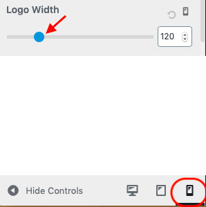
- You also can adjust site logo width for different devices by select the device beside Hide Controls.

- Upload your site icon and the icon will appear in tab

- Add your site title and Check the box to Display Site Title in Header.
Check the box if you want to Inline Logo and Site Title. You also can adjust the font size of the site title.
- Add your site tagline and Check box to Display Site Tagline. You can adjust the font size as well.

This is the output to display both site title and tagline in header
-
You also can adjust spacing of site identity

Primary Header
Primary Header allows you to customize header layout, width, border bottom size, border bottom color, mobile header layout, header background color, outside menu item color and header space.
- Go to Header > Primary Header
- You can choose a layout of header where 3 layouts are provided, width of header either content width or full width, customize border bottom size and color. You also can choose the layout of mobile header, background color of header, outside menu item color and customize header space.


Primary Menu
Primary menu allow you to customize menu, submenu, mobile menu, color, typography and spacing of menu, submenu, mega menu heading.
- Go to Header > Primary Menu
- Check box of Disable Menu will disable primary menu in header
- You also can select last item in menu from dropdown list (either none, search, button, text/html, widget or woocommerce)
You can check the box to hide last item only for menu in mobile, also can take last item outside menu if you want last item have different layout from primary menu.
- You can select submenu container animation (default, slide down, slide up or fade), adjust container border, border color
- Check the box of Submenu divider if you need which allow you to select the divider color

- You can adjust the menu breakpoint where when it reach the width you set it automatically become mobile menu. You can add label beside mobile menu. You can choose the mobile menu style (dropdown, flyout, fullscreen or no toggle)
- This is a toggle button.

You can choose its style (fill, outline or minimal) and its color - You can choose the dropdown target (icon or link), adjust border for menu items

- You can choose mobile menu border color
- You can choose link/text color and background color for normal, hover and active menu and submenu. You also can select the background image for the normal menu. For mega menu column heading, you can select the color for normal and hover. You can customize typography and spacing for menu, submenu and mega menu column heading.


Above Header / Below Header
This is Astra Pro Addon feature
- Go to Appearance > Customize > Header > Above Header / Below Header
- You can choose to merge above / below menu with primary menu on mobile. If you choose to merge, above / below menu will appear inside the primary header toggle button. If you do not merge, separate toggle for above / below menu appear on mobile
- Swap sections on mobile devices – You can swap section of 1 and 2 on mobile
- Layout – you can display above / below header section inline or stacked on mobile


Sticky Header
This is Astra Pro Addon feature
- Go to Appearance > Customize > Header > Sticky Header
- Check box of Stick Primary Header if need header while scrolling through the page
- Check box of Different Logo for Sticky Header if you want to change the logo for sticky header and upload the logo below Sticky Logo
- Check box of Different Logo for retina devices if have any
- You can adjust the sticky logo width
- Check the box of enable Shrink effect if want the sticky header to be shrink while scrolling
- Check box of Hide when scrolling down if want sticky header to be invisible while scrolling
- You can select animation for sticky header (none, slide or fade)

- You can select enable sticky header on where in dropdown list (desktop, mobile, desktop + mobile)
- You can customize elements (header, menu, submenu, mega menu heading, content) color above header, elements (header, menu, submenu, mega menu heading, outside item) color for primary header as well as elements (header, menu, submenu, mega menu heading) color below header.


Transparent Header
- Go to Header > Transparent Header
- Check this box if want to enable transparent header on complete website. After you check this box, there are more options appear.

- Check the box if you want to disable sticky header on it

- Choose to enable on desktop, mobile or desktop and mobile
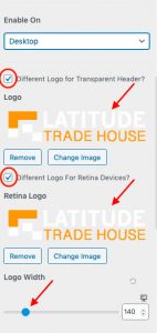
- Check the box if want to enable different logo and upload it below Logo
- Check the box if different logo for retina devices and upload logo below Retina Logo
- You can adjust the logo width as well
- You also can adjust bottom border size and color
- You can choose background overlay color, normal and hover site title color, normal menu, submenu link/text color and background color; hover menu, submenu link color, content normal text and link color, content hover link color

6.0 Footer
- Go to Appearance > Customize > Footer from dashboard

- Select Footer Widgets

Footer Widgets
- You can choose from 7 layouts provided or you do not want any widget
- You can choose the width either content width or full width
- You can adjust the padding and top border size

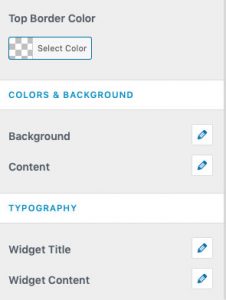
- You can adjust top border color, select background color or background image, select content normal title, text and link color, content hover link color, customize typography of widget title and widget content.
Footer Bar
- Go to Footer > Footer Bar
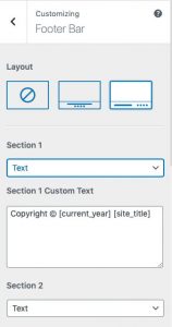
- Choose from 2 layouts provided
- In Section 1, you can choose to include either text, widget or footer menu. Normally section 1 custom text will include copyright but you can change as you wish. Section 2 dropdown list is the same as Section 1.
- You can custom text in section 2, adjust footer bar width (either content width or full width), adjust border size, select border color, select background color or image, normal content text and link color, hover link color, customize content typography, adjust footer space.

7.0 Typography, Colors, Containers
Typography
- Go to Appearance > Customize > Global > Typography
- Customize base typography and headings
Refer here for documentation
Colors
- Go to Appearance > Customize > Global > Colors
- Customize base colors and content color
Refer here for documentation
Containers
- Go to Appearance > Customize > Global > Container
Refer here for documentation
8.0 Customize Scroll to Top button
Scroll to top module on Astra Pro Addon help to add scroll to top action on web page.
- Go to Appearance > Customize

- Select Global

- Select Scroll To Top

- You can choose to Display on either Desktop, Mobile or Desktop + Mobile
- You can choose scroll to top to align on left or right of page
- You can adjust the icon size (size of icon font) and
border radius (apply rounded border for icon background) - You also can change normal and hover icon color and background color
9.0 Customize Blog
Add blog post
- Go to Posts > Add New
- Enter title for your post
- Enter body content of post
- Set a featured image at right sidebar (usually shown on top of post and also is post’s thumbnail image)

- Add tags and categories for post at right sidebar. Categories more broader while tags more specific.
Click Publish if done.
Create separate blog page
By default, WordPress display blog post as home page
- Create one home page and one blog page
- Go to Settings > Reading

- Choose A static page as your homepage displays. Choose home page for Homepage and Choose blog page for Posts page.

- Click Save Changes at the bottom
- Go to Appearance > Customize
- Select Homepage Settings

- Select A static page for Your homepage displays. Select home page for Homepage and blog page for Posts page

- Click Publish after done
Customize blog post
- Go to Appearance > Customize
- Select Blog

Blog / Archive
Blog Pro module in Astra Pro add more customization options in blog layouts
- Select Blog / Archive
Archive page is a collection of posts
- You can choose either full content or excerpt for post content
Full content – entire written text in post visible in archive page
Excerpt – display short extract of content, default length is 55 words but you can control the word count to display - You can manage the post structure. You can reorder or hide featured image, title & blog meta, publish date, comments, category, author, tag and read time. To reorder simply drag and drop the items. To hide the item, click the eye icon at the left. If you hide title and blog meta, meta options disappear too.

- You can adjust the content width of blog page

- You can set typography for Archive title and Post title.

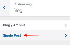
Single Post
Blog Pro in Astra Pro Addon add more options for single post
- Go to Appearance > Customize > Blog > Single Post
- You can choose to display or hide featured image, title and meta by click on the eye icon
- You also can display author information
- It will load previous blog post below current post
- You also can remove featured image padding
(But it work only on Boxed and Content Box container layout)
10.0 Tips to improve your website performance
Things to take note:
Website speed is important for SEO, thus image need to be optimize before upload so that it won’t affect much on the loading speed of website
- Choose right format
Colorful image save as jpeg while transparent image save as png - Use image compression
Save image for web using Photoshop to reduce file size without reducing the quality of image
Save image for web using Photoshop
- Open your image in Photoshop
- Go to File > Save for Web

- A pop out shown, Select appropriate format and Click Save. Your image had been compressed.

Add image alt text
- Image alt text is also important for search engine to crawl. It appears to describe the image if image fail to load on the webpage
Take note for image alt text
– Describe the image specifically
– Use keywords appropriately but not every single image which might cause keyword stuffing
– Not more than 125 characters
– No special characters
- Login to WordPress dashboard
- Open post or page to edit the content
- Click on the image to open Image Settings in Block tab of right sidebar

- Add appropriate Alt Text and Click Update.

- Repeat the steps from 3 – 5 for all images in the website
Add Heading Tags
Headings for web pages are important for readability and help to add SEO value. It shows the topic of a particular page which helps search engines to find the page easily when people search for it. There are 6 sizes of heading tags. It is used to differentiate heading and subheading from all the text in content.
H1 – Title of webpage
H2 – breaking H1 content into bits
H3 – breaking H2 contents
Take note for heading tags
– Normally H1 to H3 is sufficient enough for a web page unless the page is text heavy.
– Maintain hierarchy level while using heading tags and don’t skip a level
– Do not use header tags just only for some text to stand out
- Login to WordPress dashboard
- Open post or page to edit the content
- Highlight the text and Click ‘Paragraph’ options in toolbar

- Pick from six heading tags in dropdown list shown. The text appears as heading now.
Add Outbound Link
Outbound link is the link that link your website to others website. It is important to increase trust and quality of the website.
There are 2 types: nofollow, dofollow
– Nofollow tell search engine not to follow the link
– Dofollow pass ranking power from your website to targeted page
Things to take note:
– Insert relevant natural outbound link into webpage (don’t force link)
– Ensure link open in new tab so that reader can come back to your site later
– Best to have but not too much (may cause distraction and push visitor away from your site)
- Login to WordPress dashboard
- Open post or page to edit the content
- Highlight text and Click icon below in toolbar

- Toolbar below appears below the text. Click settings icon
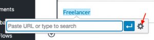
- A pop out shown. Add the url link in URL field. Check box of Open link in new tab. Click Add Link and outbound link created.

Check mobile version
- Go to Appearance > Customize
- Click the mobile icon at bottom. You can view the live preview at right side.

- Check for every page. Check on this website for mobile friendly.