Educational Directories - Tadika Bestari
Year
Client
Service
Tag
Landing Page
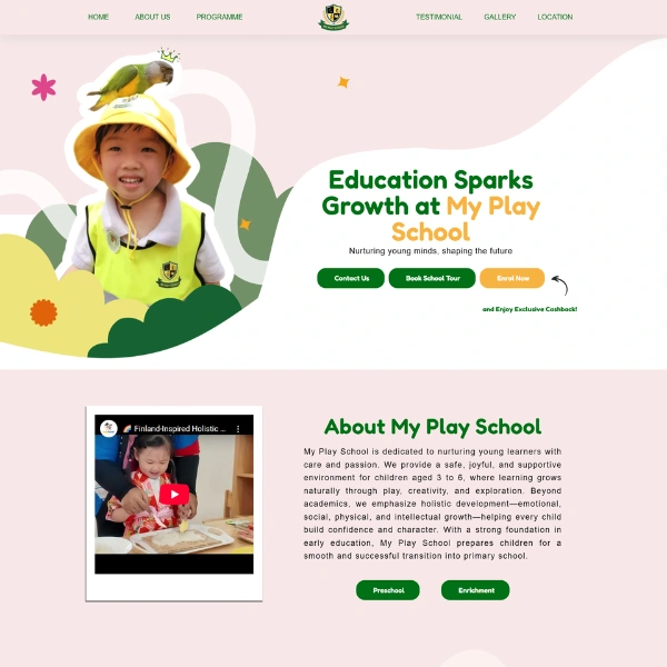
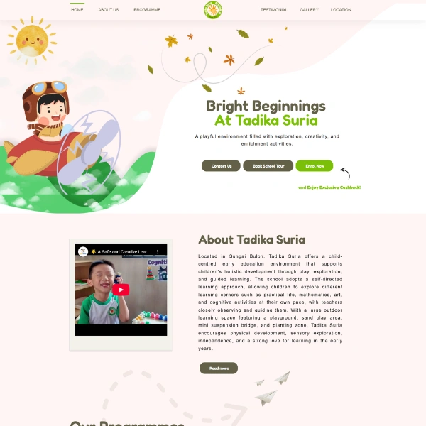
Tadika Bestari is an education-focused website designed to present a modern preschool brand through a clear and engaging digital presence. The project centers on creating an informative and visually appealing platform that highlights the school’s philosophy, programs, and values.
The primary goal is to build trust with parents while simplifying the process of learning about the preschool’s offerings. The website targets families seeking a nurturing, structured, and high-quality early childhood education experience.
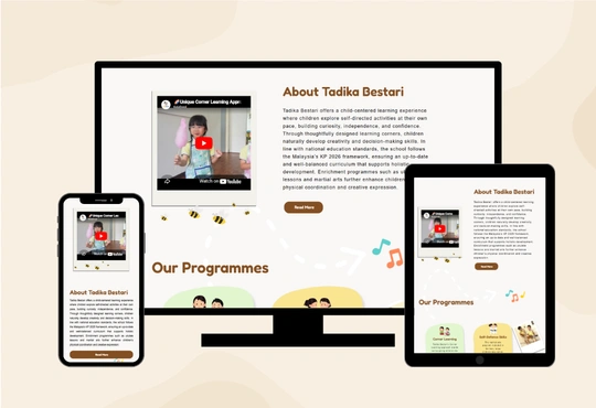
The purpose of the Tadika Bestari website is to provide parents with a comprehensive understanding of the preschool’s identity, including its educational approach, services, and environment.
It solves the common problem of scattered or unclear information by presenting everything in a structured and accessible way—from the “About Us” section to detailed service offerings. The platform enhances user experience by allowing parents to quickly evaluate whether the preschool aligns with their expectations and their child’s needs.
The primary audience for this website includes parents with children aged 3–6 years old. Working families looking for trusted childcare and early education. Parents interested in structured learning environments with holistic development. These users typically value clarity, trust, safety, and educational quality when making decisions.

Key Functionalities
1. Search and Filter
While the platform is primarily informational, it allows users to easily navigate content through structured sections and intuitive layouts, helping them quickly find relevant information such as programs, age groups, and services.
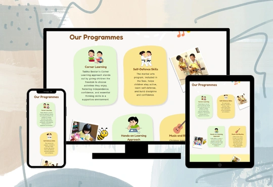
2. Product/Service Listings
The website clearly presents Tadika Bestari’s services, including. Early childhood education programs. Age-based learning modules. Enrichment activities. Each service is organized into well-defined sections with concise descriptions, helping parents understand the value and structure of each offering.
3. Responsive Design
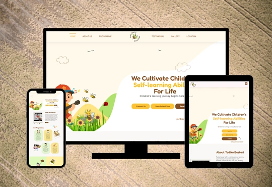
The website is fully responsive, ensuring a seamless experience across desktops, tablets, and smartphones. Special attention is given to mobile usability, as many parents browse on their phones.
4. Content Management
The platform is built with a flexible content management approach, allowing administrators to easily update. School information. Program details. Announcements or updates. This ensures the website remains relevant and up-to-date without requiring technical expertise.
The Challenges

One of the key challenges was presenting educational content in a way that is both informative and emotionally appealing to parents. Striking a balance between professionalism and warmth was essential. Another challenge involved optimizing the layout for mobile devices, ensuring that important information such as services and contact details remains easily accessible without overwhelming the user.
The Solutions
To address these challenges. A clean and structured UI/UX approach was implemented, using clear typography and spacing to improve readability. Content was broken into digestible sections, allowing parents to quickly scan and understand key information. Mobile-first design principles were applied to ensure smooth navigation and accessibility across all devices. Strategic call-to-actions were placed throughout the site to guide user interaction and increase inquiries.

Website Design
The Tadika Bestari website features a clean, calm, and education-focused design that reflects the school’s commitment to nurturing early childhood development in a structured and supportive environment. Using the Poppins font and a balanced colour palette of dark yellow (#FFC230), earthy dark tones (#844F23), fresh lime accents (#DEF9BB), and clean neutrals (#000000, #ffffff, #dddddd), the design conveys growth, strength, and trust. The green tones represent agriculture, sustainability, and field expertise, while the darker shades reinforce stability and industrial reliability. Light grey and white backgrounds provide clarity and clean spacing, ensuring that product information and service details remain easy to read. Each section is carefully structured to guide visitors through product catalogues, service categories, and company information in a clear and organized manner. The overall layout emphasizes simplicity and accessibility, avoiding unnecessary visual clutter while maintaining a welcoming and professional feel. Subtle imagery of children and learning activities enhances the content without overwhelming it, helping to build emotional connection and trust. The design successfully balances professionalism and warmth, reinforcing Tadika Bestari’s identity as a reliable and nurturing preschool for early learners.