Educational Directories - Tiny Seeds Education
Year
Client
Service
Tag
Landing Page
Tiny Seeds Education is a comprehensive educational landing page designed to showcase a multi-stage early childhood and primary care institution. Operating within the Early Childhood Education and Care niche, the project aims to present a nurturing environment that balances guided academics with hands-on exploration. Its primary goal is to establish a strong digital presence that drives student enrollment by beautifully displaying the center’s holistic programs, which support cognitive, social, and emotional growth from infancy up to primary school age.
The primary purpose of the website is to solve the research fatigue and confusion parents face when looking for a continuous, long-term education and childcare provider. Instead of forcing parents to visit multiple centers for different age groups, this platform serves as a unified digital storefront that simplifies the discovery process. It allows parents to effortlessly explore a complete educational pathway, spanning from infant care to primary school tuition, making it simple to understand the center’s mission, review the core curriculum, and easily initiate the enrollment process.
The platform primarily targets busy, working parents with children ranging from infants (2 months onwards) up to primary school students (12 years old) who are seeking a trusted, long-term educational partner. These parents highly value structured, trilingual academic excellence (English, Malay, and Mandarin) balanced with a nurturing, holistic approach to emotional and social development. They specifically look for safe childcare environments, engaging early learning frameworks, and reliable primary school after-school daycare and tuition support that fits into their demanding professional schedules.

Key Functionalities
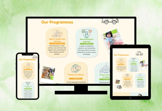
1. Programme & Core Curriculum Showcase
The website clearly presents Tiny Seeds' diverse offerings, neatly categorizing programs by age group and developmental stage. Visitors can easily navigate through specialized listings including Baby & Toddler Play and Care (2 months onwards), Trilingual Excellence (4-6 years old), Balanced Holistic Approach (4-6 years old), and Primary Daycare & Tuition (7-12 years old) to see how the school builds a continuous academic foundation.
2. School Tour Booking & Enrollment Inquiry Forms
Integrated enquiry sections allow parents to seamlessly schedule physical campus visits ("Book School Tour") or contact the registration team directly for fee structures and intake availability. This centralized lead capture system improves administrative communication efficiency and significantly simplifies the initial student registration workflow.
3. Location-Specific Branch Directory
A dedicated section introduces the preschool’s physical campuses, featuring detailed geographic mapping for each of the Tiny Seeds branches. The website neatly organizes addresses, specific operating hours, and age-group availability, allowing parents to effortlessly pinpoint the most convenient neighborhood center.
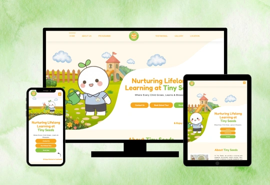
4. Responsive Design Layout
The website is designed with a fully responsive architecture, ensuring that all program graphics, text blocks, and inquiry forms adapt beautifully across desktops, tablets, and smartphones. This guarantees that busy parents can comfortably browse the website, read about the curriculum, and submit enrollment inquiries on the go.
The Challenges

The main challenge was presenting a wide-reaching educational pathway, covering infants from 2 months old all the way to primary students up to 12 years old in a way that is simple, clean, and easy to understand for parents. Many parents associate wide-range centers with disorganized environments, so the website needed to clearly highlight a highly structured, age-appropriate, and enjoyable learning approach for every distinct stage. Another challenge was balancing multiple target demographics within one platform, which include new mothers seeking gentle toddler care, parents comparing preschool trilingual frameworks, and families looking for strict primary school tuition. The content needed to be organised clearly to avoid confusion while maintaining smooth navigation across the different age categories. In addition, the website needed to look warm, child-friendly, and welcoming while still maintaining a professional and highly trustworthy corporate image suitable for a premium educational facility.
The Solutions
To address these challenges, we structured the website with a clean, visual-first hierarchy, using distinct age-bracket tags, organized section blocks, and simplified iconography to explain each developmental tier without causing cognitive overload. We successfully balanced the multiple target segments by splitting the content into clear, easily navigable sections, using independent visual layout blocks so parents can instantly jump directly to the infant, preschool, or primary school details relevant to their family. Finally, we crafted a soft, premium visual identity combining warm, nurturing tones with highly structured typography, perfectly blending a comforting, cheerful early-education atmosphere with a polished, professional layout that establishes immediate credibility and trust with inspecting parents.

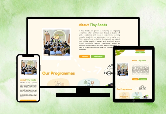
Website Design
The Tiny Seeds Education website utilizes a playful, rounded, and highly readable font hierarchy that perfectly matches a friendly early-learning environment. The layout effectively structures its color palette by using soft #FFFFFF (pure white) and warm #FFF9EB (cream) for the main alternating section backgrounds, creating a soft, comforting canvas that keeps the long-form content clean and organized. Gentle, muted tones like #DFF5EC (soft mint green) and #FFE8B6 (pastel yellow) are applied to individual rounded container blocks to neatly categorize separate program tracks, branch locations, and interactive elements. To establish a strong visual hierarchy, vibrant #8CC340 (leaf green) and #F8A51E (vibrant orange) are used as dominant headline text and primary accents for critical call-to-action buttons like “Contact Us,” “Book School Tour,” and “Enrol Now,” instantly drawing parents’ eyes to key conversion paths while maintaining a trustworthy, professional presentation.