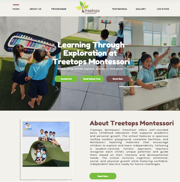
Educational Directories - Knowledge Tree Montessori Preschool
Year
Client
Service
Tag
Landing Page
Knowledge Tree Montessori is a modern and visually engaging corporate landing page created for a premier early childhood education provider. Operating within the Early Childhood Education & Preschool niche, the project aims to establish a highly professional digital gateway that highlights a unique hybrid learning philosophy. The key goal of the website is to streamline the student enrollment pipeline across multiple campuses while illustrating how the institution supports each child’s cognitive, emotional, and social development.
The primary purpose of the website is to solve the research fatigue and confusion parents face when looking for a continuous, long-term education and childcare provider. Instead of forcing parents to visit multiple centers for different age groups, this platform serves as a unified digital storefront that simplifies the discovery process. It allows parents to effortlessly explore a complete educational pathway, spanning from infant care to primary school tuition, making it simple to understand the center’s mission, review the core curriculum, and easily initiate the enrollment process.
The platform primarily targets urban, modern parents with young children who are seeking a nurturing and progressive foundational education that goes beyond traditional memorization. These parents value structured methodologies like Montessori Education paired with the 9 Multiple Intelligences framework, seeking an environment that develops their child’s independence, mindfulness, and creative expression. Additionally, the website serves regional families living near Ara Damansara, Bukit Jalil, Desa ParkCity, and Setia Alam looking for localized campus information, as well as early childhood educators seeking career opportunities within a dedicated recruitment channel.

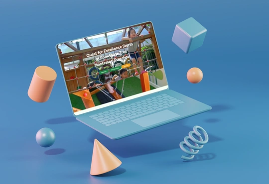
Key Functionalities
1. Programme & Core Curriculum Showcase
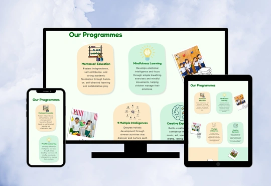
The website clearly presents Knowledge Tree Montessori's core pillars, detailing specialized services such as Montessori Education, the 9 Multiple Intelligences approach, Creative Expression, and Mindfulness Learning. Visitors can easily understand how children cultivate independence and discover their unique strengths through hands-on, meaningful exploration.
2. School Tour & Team Recruitment Inquiry Forms
Integrated enquiry sections allow parents to seamlessly book physical campus tours ("Book School Tour") or check student seat availability. The website also features a "Join Our Team" interactive application portal, improving communication efficiency for both prospective clients and job-seeking educators.
3. Location-Specific Branch Directory
The platform maps out a dedicated branch directory section highlighting the institution’s campuses in Ara Damansara, Bukit Jalil, Desa ParkCity, and Setia Alam. The website neatly organizes specific address details, operational hours, and age-group parameters, allowing parents to effortlessly locate the nearest neighborhood center.
4. Responsive Design Layout
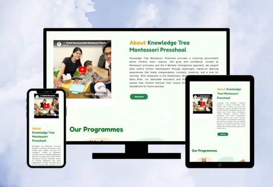
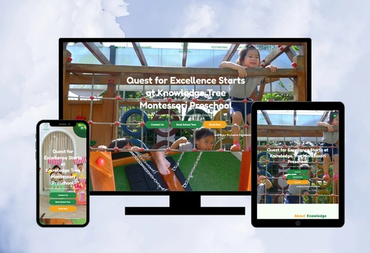
The website is designed with a fully responsive architecture, ensuring that all program graphics, text blocks, and inquiry forms adapt beautifully across desktops, tablets, and smartphones. This guarantees that busy parents can comfortably browse the website, read about the curriculum, and submit enrollment inquiries on the go.
The Challenges

The main challenge was presenting a sophisticated, multi-layered early childhood curriculum—combining strict Montessori principles with a 9 Multiple Intelligences framework—in a way that is simple, clear, and easy to understand for parents. Many parents associate academic systems with rigid structures or confusing jargon, so the website needed to clearly highlight a nurturing, hands-on, and engaging approach to development. Another challenge was balancing multiple target audiences within a single platform, which includes parents looking to enroll their children across four separate geographic campuses, families analyzing individual branch details, and educators looking for career opportunities. The content needed to be organised clearly to avoid confusion while maintaining smooth navigation for all visitor types. In addition, the website needed to look child-friendly, warm, and welcoming while still maintaining a professional and highly trustworthy corporate image suitable for educational partnerships.
The Solutions
To address these challenges, we structured the website with a clean, visual-first hierarchy, using playful illustrative pathways, soft container backgrounds, and clear iconography to explain the hybrid curriculum without causing cognitive overload. We successfully balanced the multiple target segments and campuses by splitting the content into distinct, easily navigable sections, using independent visual layout grids so parents can instantly pinpoint their preferred location or program track. Finally, we crafted a soft, premium visual identity combining warm cream tones with vibrant green accents, perfectly blending a comforting, cheerful early-education atmosphere with a highly polished corporate layout that establishes immediate professional credibility and trust.

Website Design
The Knowledge Tree Montessori website uses the Fredoka font to create a rounded, friendly, and highly readable typeface hierarchy that perfectly matches a warm early-learning environment. The color theme is carefully selected from the website design to reflect a natural, nurturing, and professional environment, utilizing #FFFFFF (pure white), #F6FFF6 (soft off-white green), #B9EECC (light mint green), #FFE0AD (warm cream), #F2A420 (vibrant orange), and #238647 (deep forest green). These colors work together to create a bright, child-friendly appearance while maintaining a premium and trustworthy feel.
Clean #FFFFFF and soft off-white green (#F6FFF6) are utilized for backgrounds and section separation to keep the reading experience light and gentle on the eyes. Light mint green (#B9EECC) and warm cream (#FFE0AD) provide refreshing, playful backdrops for framing the different program containers and location blocks. Meanwhile, the rich, deep forest green (#238647) is strategically applied to main headings and primary call-to-action buttons, while the energetic vibrant orange (#F2A420) is used for active button highlights, establishing a strong visual hierarchy that easily guides parents toward enrollment. The overall design is highly structured, visually balanced, and fully responsive across all device viewports.