Educational Directories - Tadika Big Apple Ara Damansara
Year
Client
Service
Tag
Landing Page
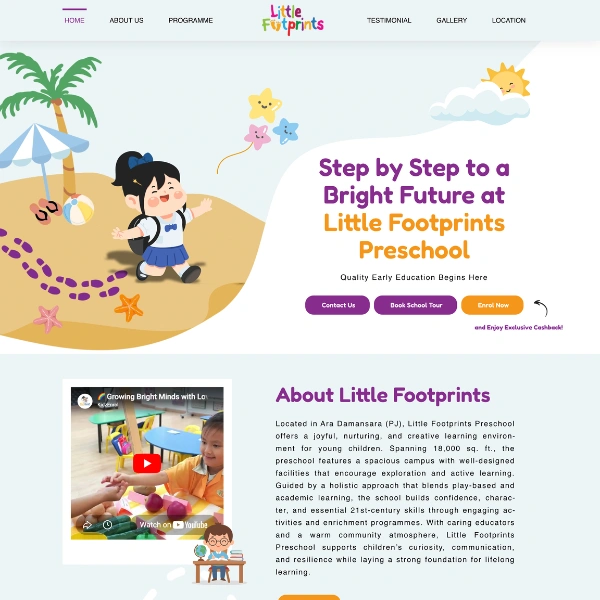
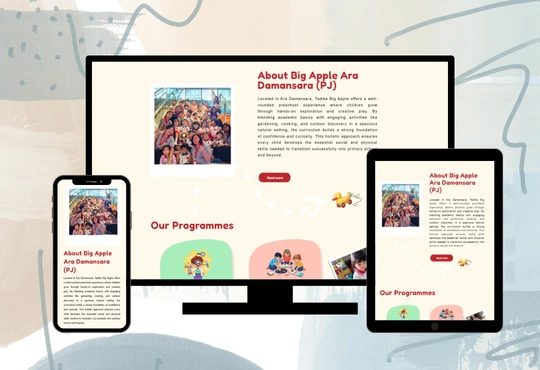
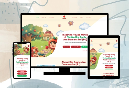
Tadika Big Apple Ara Damansara (PJ) is a preschool that provides early childhood education for children aged 3–6, focusing on creating a nurturing, safe, and engaging learning environment. It aims to support children’s development through structured learning, play-based activities, and social interaction to build a strong foundation for their future education.
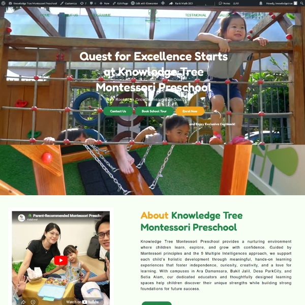
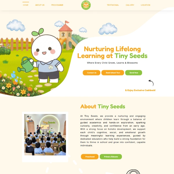
The website is an informative platform designed to introduce parents to the preschool’s environment, educational approach, and services. It presents key information in a clear and organized way, allowing parents to easily understand the programs, facilities, and overall learning experience offered by the preschool.
The main purpose of the website is to provide parents with reliable and easy-to-understand information about the preschool. It helps reduce confusion by presenting everything in one place, making it easier for parents to compare and evaluate their options.
In addition, the website is designed to guide parents toward taking action, such as making inquiries or enrolling their child. By building trust and providing clarity, it supports parents in making confident decisions about their child’s early education.
The website targets parents with children aged 3–6 years old, especially working families in Ara Damansara and Petaling Jaya who are looking for a safe, nurturing, and trustworthy preschool environment, as well as clear and accessible information to help them choose the best early education option for their child.

Key Functionalities
1. Clear Navigation
While the website is primarily informational, it allows parents to easily navigate through structured sections and a clear menu layout. This helps users quickly find relevant information such as programs, age groups, facilities, and contact details without confusion.
2. Product/Service Listings
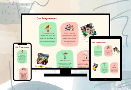
The website clearly presents Tadika Big Apple’s services, including early childhood education programs, learning modules, and enrichment activities. Each section is well-organized with concise descriptions, helping parents understand the structure and benefits of each program offered.
3. Responsive Design
The website is fully responsive, ensuring a seamless experience across desktops, tablets, and smartphones. Special attention is given to mobile usability, as many parents browse on their phones.
4. Content Management
The platform is built with a flexible content management approach, allowing administrators to easily update. School information. Program details. Announcements or updates. This ensures the website remains relevant and up-to-date without requiring technical expertise.
The Challenges

One of the main challenges in developing the Tadika Big Apple Ara Damansara (PJ) website was achieving consistency in theme colors and overall design while maintaining a child-friendly yet professional appearance. Balancing visual appeal with usability was also difficult, as the website needed to present a large amount of information without overwhelming parents. Additionally, ensuring a smooth and responsive experience across different devices required careful adjustments and testing to maintain layout consistency.
The Solutions
To address these challenges, a consistent design system was implemented by defining a clear color palette, typography, and layout structure that aligns with the preschool’s branding. A user-centered approach was applied to simplify navigation and organize content into clear sections, making it easier for parents to find important information. Furthermore, responsive design techniques and thorough cross-device testing were used to ensure the website performs well on desktops, tablets, and mobile devices, providing a seamless user experience.

Website Design
Tadika Big Apple Ara Damansara (PJ) website features a bright, friendly, and child-focused design that reflects the preschool’s commitment to creating a fun, nurturing, and engaging early learning environment. Using the Fredoka font and a vibrant colour palette of warm coral (#ff8271), fresh green (#22B768), deep red (#BA282E), soft cream (#FFF6DE), light green (#76d891), and clean white (#ffffff), the design conveys warmth, positivity, and growth. The use of green tones represents development, learning, and a healthy environment, while the coral and red accents add energy, friendliness, and emotional warmth that appeal to both children and parents.
Clean backgrounds and a simple layout ensure that information is easy to read and navigate. The website is well-structured, guiding parents through programs, facilities, and key details without clutter. Subtle imagery of children and activities enhances the experience, while the overall design balances playfulness and professionalism, reinforcing the preschool’s identity as a trusted and nurturing environment.