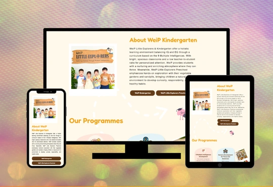
Educational Directories - WeiP Little Explorers
Year
Client
Service
Tag
Landing Page
WEIP Little Explorers Preschool is a website developed for the early childhood education industry, specifically designed to showcase the preschool’s philosophy, programs, and services.
The primary goal of the platform is to provide parents with clear, engaging, and trustworthy information about the preschool while simplifying the enquiry and enrolment process.
The website emphasizes a nurturing learning environment, modern educational approaches, and transparency—helping parents make informed decisions for their children’s early development.
The website serves as a digital introduction and conversion platform for prospective parents.
It solves the common challenge parents face when searching for reliable childcare by presenting structured and easy-to-understand information about the preschool. Highlighting unique teaching approaches and facilities. Providing a seamless way to enquire or register interest.
Ultimately, the platform enhances user experience by reducing confusion and building trust through well-organized content and visual storytelling.
The primary audience includes parents with children aged 2 to 6 years old. Working professionals seeking reliable childcare solutions. Families looking for a structured early education program. Parents interested in holistic and modern learning approaches. These users typically value safety, curriculum quality, environment, and convenience when making decisions.

Key Functionalities
1. Search and Filter
The platform allows users to explore preschool information efficiently by:
- Navigating structured sections such as About Us and Services
- Accessing location-based or branch-specific details (if applicable)
- Quickly identifying relevant programs and offerings
2. User Accounts
While the platform primarily functions as an informational website, integration with the enrolment system allows:
- Parents to submit enquiries or registration details
- Data collection for follow-up and communication
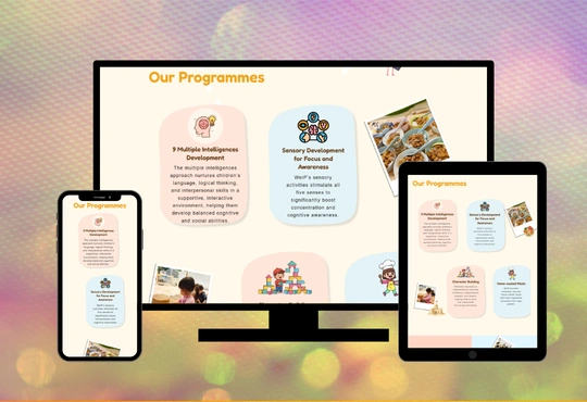
3. Product / Service Listings
The website clearly presents its services, including:
- Educational programs by age group
- Curriculum highlights
- Facilities and learning environment
Each section is structured with:
- Clear descriptions
- Visual support (images and layout hierarchy)
- Easy-to-scan content for better readability
4. Interactive Elements
Interactive components are designed to improve engagement and conversion:
- Enquiry and registration forms
- Call-to-action buttons (e.g., “Enrol Now”, “Contact Us”)
- Smooth navigation and scrolling experience
The Challenges

Several challenges were encountered during the development process. First, balancing professionalism with a child-friendly design proved difficult, as it required avoiding overly childish visuals while still appealing to parents. Second, content structuring demanded careful attention to ensure that information remained clear, concise, and not overwhelming for the reader. Finally, conversion optimization presented its own challenge: encouraging parents to take action—such as enquiring or registering—without being intrusive or pushy.
The Solutions
To address these challenges, the following solutions were implemented. First, a clean and modern UI design was adopted, using soft color palettes, structured layouts, and a minimalistic design to maintain professionalism without feeling cold or overly corporate. Second, a strategic content hierarchy was established by organizing information into clear sections—such as About, Services, and Contact—which improved readability and prevented parents from feeling overwhelmed. Third, strong call-to-action placement was prioritized, with enquiry buttons and forms positioned strategically throughout the site to improve user conversion without being intrusive. Finally, the user experience (UX) was optimized to ensure smooth navigation, fast loading times, and full mobile responsiveness, making it easy for parents to take action on any device.

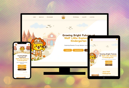
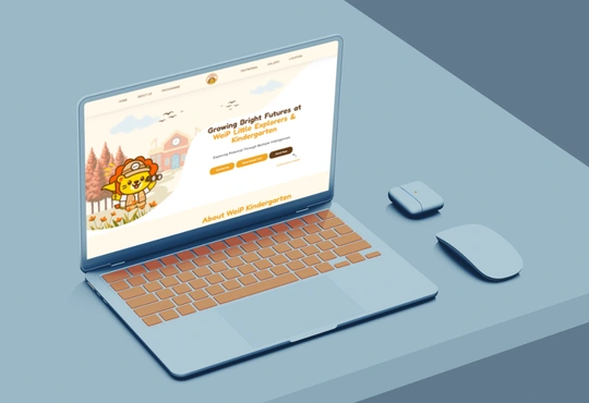
Website Design
The WeiP Little Explorers website features a clean, calm, and education-focused design that reflects the school’s commitment to nurturing early childhood development in a structured and supportive environment. The design employs the Poppins font alongside a balanced colour palette: dark yellow (#FFC230), earthy dark tones (#844F23), fresh lime accents (#DEF9BB), and clean neutrals (#000000, #ffffff, #dddddd). Together, these colours convey growth, strength, and trust. The green tones evoke agriculture, sustainability, and field expertise, while the darker shades reinforce stability and industrial reliability. Light grey and white backgrounds provide clarity and clean spacing, ensuring that product information and service details remain easy to read. Each section is carefully structured to guide visitors through product catalogues, service categories, and company information in a clear and organised manner. The overall layout emphasises simplicity and accessibility, avoiding unnecessary visual clutter while maintaining a welcoming and professional feel. Subtle imagery of children and learning activities enhances the content without overwhelming it, helping to build emotional connection and trust. Ultimately, the design successfully balances professionalism and warmth, reinforcing WeiP Little Explorers’ identity as a reliable and nurturing preschool for early learners.