Savage Gears
Year
Client
Savage Gears
Service
Tag
Landing Page
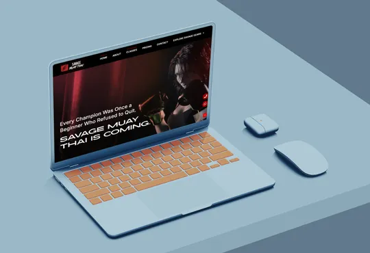
Savage Muay Thai Gym is a website project developed for a Muay Thai training gym specialising in martial arts, fitness, and combat sports. The website aims to establish the gym’s online presence, introduce its identity, and showcase its training services to individuals interested in learning Muay Thai and improving their physical fitness.
The project focuses on presenting the gym professionally while helping potential members understand its offerings, training environment, and value as a martial arts training destination.
The primary purpose of the website is to serve as an online information and promotional platform for Savage Muay Thai Gym.
It provides visitors with an accessible way to learn about the gym, understand its background, and explore the available training services without having to visit the premises first.
By organising important information into dedicated sections, particularly About Us and Services, the website helps potential customers make informed decisions about joining the gym. It also strengthens the gym’s digital presence and provides a central platform for promoting its Muay Thai training offerings.
The website primarily targets individuals interested in martial arts, combat sports, and fitness training.
Its potential audience includes:
Beginners: Individuals who want to learn Muay Thai and develop fundamental martial arts skills.
Fitness Enthusiasts: People looking for an engaging workout to improve strength, endurance, and overall physical fitness.
Martial Arts Practitioners: Individuals interested in developing their striking techniques and improving their existing Muay Thai abilities.
Combat Sports Enthusiasts: People who have an interest in Muay Thai, boxing, and other combat-related disciplines.
Prospective Gym Members: Individuals looking for a suitable training facility and wanting to understand the gym’s background and services before joining.

Key Functionalities
1. Trial Class Enquiry Integration
The website incorporates a trial class enquiry feature that allows prospective members to express their interest in experiencing the gym's training sessions. By integrating direct WhatsApp links into prominent call-to-action sections, visitors can conveniently contact the gym to enquire about trial arrangements without navigating through complicated registration procedures.
2. Multi-Tier Training Package Comparison
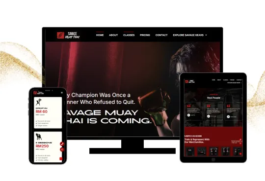
A dedicated pricing section showcases different training packages, ranging from individual sessions to multiple-session bundles. Each package displays its corresponding price and session value, allowing visitors to compare the available options and evaluate the cost-effectiveness of committing to longer training programmes.
3. Personalised Coaching and Technique Development
The website highlights coach-guided training experiences that emphasise individual technique improvement and physical development. Through padwork exercises, striking combination practices, and real-time technique corrections, the gym communicates its focus on helping members develop proper Muay Thai fundamentals, improve striking accuracy, and build overall conditioning.
4. Training Programme Categorisation
The website features dedicated training programme descriptions that distinguish between different Muay Thai training styles and fitness objectives. Morning Burn focuses on cardio and endurance, Fight Camp caters to advanced practitioners through sparring and fighter-specific drills, while Savage Muay Thai emphasises padwork, striking combinations, and physical conditioning. This structured presentation helps visitors identify programmes that match their fitness goals and experience levels.
The Challenges
One of the main challenges was presenting the gym’s different Muay Thai training programmes in a way that catered to individuals with varying fitness goals, experience levels, and training expectations. The website also needed to communicate the differences between each programme, display training schedules and pricing packages clearly, and encourage potential members to enquire about joining. Additionally, establishing a strong brand identity was important to reflect the gym’s energetic and disciplined training culture while ensuring that visitors could easily access essential information and understand the services offered.
The Solutions
To address these challenges, the website was structured with dedicated sections for training programmes, class schedules, pricing packages, and customer testimonials. Each training programme was accompanied by descriptive content to help visitors understand its purpose and suitability, while the tiered pricing presentation made it easier to compare available training options. Direct WhatsApp integration was also implemented to simplify trial class enquiries and customer communication. Combined with consistent brand messaging, clear content organisation, and responsive design, these solutions help create an engaging online experience while supporting the gym’s promotional and customer acquisition objectives.

Website Design
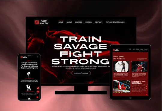
The Savage Muay Thai Gym website uses a clean, modern, and bold typography hierarchy to create a powerful visual identity that reflects the intensity, discipline, and competitive spirit of Muay Thai. The colour palette is carefully selected to communicate strength, aggression, and professionalism through four core colours: black (#000000), deep red (#B30102), dark maroon (#660A09), and white (#FFFFFF). Together, these colours establish a striking combat-sports aesthetic while maintaining a polished and cohesive visual presentation.
Deep black (#000000) serves as the primary background colour, creating a strong, premium dark-mode appearance that reinforces the gym’s bold identity. The vibrant red (#B30102) is strategically used for prominent headings, highlights, and call-to-action elements, symbolising energy, power, and determination while drawing attention to important website sections. Dark maroon (#660A09) provides additional visual depth through secondary accents and supporting design elements, complementing the brighter red without overwhelming the overall interface. White (#FFFFFF) is used for typography, content descriptions, and contrasting elements to maintain readability and visual balance against the darker backgrounds.
The combination of black and red creates an intense, athletic atmosphere that reflects the competitive nature of combat sports, while white ensures clarity and accessibility throughout the website. The overall design maintains a consistent visual hierarchy, strong contrast, and responsive layout, delivering an engaging browsing experience across desktops, tablets, and mobile devices.